Posters giving straightforward travel information date back to the stagecoach era, an example from 1706 showing that the journey from York to London took four days by stagecoach. Continuing this tradition of conveying just basic times and fares, the earliest railway poster advertising a passenger service was published by the Stockton and Darlington railway - an experimental passenger service which was introduced three weeks after the line opened.
Slow journeys (although fast by stagecoach standards) such as 9 hours from Hull to London are thus revealed at a time when those who had previously walked everywhere now had to make do with open wagons. Thomas Cook's posters promoting his temperance excursions and those for the Great Exhibition at Crystal Palace in 1851 were however indicative of rail's surging popularity even though the posters themselves were just printed text.
With the development of colour lithographic printing in the 1860's, things began to change so that by the 1880's posters usually included imagery along with an increasingly wide colour palette.As well as advertising attractive destinations, railway posters were revealing the benefits of new technology such as nonstop travel made possible by water-troughs.
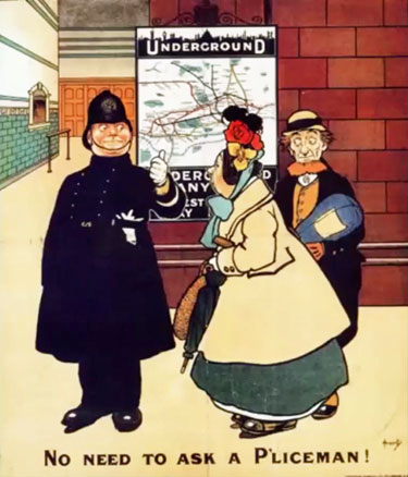
At the London underground (UERL) high-quality advertising was developed under the guidance of Frank Pick = appointed Publicity Officer in 1906. Pick saw posters as a way to both advertise the system and enrich urban life with good art & design. He recognised the value of humour in the poster captioned "no need to ask a p'liceman" in an age when police reputation was at a low ebb and the music hall song "Ask a p'liceman" was poking fun at the force.
By this time artistic careers were being made by the production of recognisable images, e.g. John Hassall's 1908 Skegness is So Bracing which endured in various forms until 1956. The classless appeal of Underground travel was celebrated, as was luxury long-distance travel on the likes of the Southern Belle until in 1914 the message went into reverse with the need to exhort people not to travel but instead to enlist now.
In following where Frank Pick had led with his introduction of clear "Johnston" font for signage around 1913, the LNER introduce a near copy "Gill Sans" typeface in 1929 - a font evolved at this time by monumental sculptor Eric Gill who had been a student of Edward Johnston. This typeface was taken on by British Railways and used on all signage through to privatisation.
Pick's art and design interest included improving the "tangled knitting" appearance of the increasingly complicated underground map. In 1933 he commissioned Henry Beck to redesign this and he came up with the diagrammatised map that we know today, albeit with subsequent new lines added. This map influenced railway companies and British Railways to adopt a similar approach that is still used to this day.
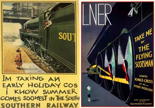
Advertising really came into its own with the groupings, with the GWR which did not face undue competition settling for a rather academic approach of studying castles, abbeys and cathedrals. The Southern, beset by the costs of accommodating commuters, was keen to boast its extending electrification and to promote off-peak custom such as shopping and leisure, with the slogan that "summer comes sooner in the south", but portrayal of a character Sunny South Sam did not accord with reality. The London Midland and Scottish had fallen heir to the Midland Railway's "best way" of doing things: it enlisted artists including naval painter Norman Wilkinson, only Augustus John, out of 16 academicians invited, turning down the invitation. Most artists saw this as a way of making their work known to a wider public than would ever visit an art gallery. The London and North Eastern made greatest use of poster artists to capture iconic locations like the Forth Bridge, with Tom Purvis producing a six-poster set of East Coast Joys in 1931, while the Flying Scotsman was made to look much grander than the engine in the Southern's photo-painting.
With World War II came fresh discouragement to travel. Then following nationalisation, British Railways with its lion and wheel iconography promoted regional identities with totems of different colours. Renowned artists such as Terence Cuneo and David Shepherd now depicted the changing railway scene, but with diminishing market share came reduced budgets, and funding was now switched to television advertising, bringing to an end the great age of railway posters.
A British Rail's TV ad of 1986 became perhaps BR's most famous and amusing, (with a final shot which would be deemed unacceptable today) produced by the advertising agency J. Walter Thompson for British Rail as part of their Inter-City 125 promotion.
It can't have been cheap to make and certainly involved the painting of a class 37 locomotive in Police livery which was to be seen around the Crewe area for some time after (The locomotive was painted in a temporary, water-based paint, which was intended to be easily removable but proved difficult to wash off!). Such expenditure contributed to far less attention being given to poster advertising in the 1970s and 1980s.
If you are interested in seeing many of the posters, these can be found on the website of the Science Museum and London Transport Museum (even after Frank Pick's retirement in 1940, London Transport continued with a particularly rich tradition of artistic posters. Meanwhile on the rest of the network, with a few honourable exceptions the standard of railway posters has markedly declined. Mike finished by making an appeal that Pick's message should not be forgotten, that posters should both advertise the system and enrich urban life with good art & design.
To view Mike's presentation, click on the Video Icon below.

Report by John Fender & John Yellowlees with assistance from Mike Willmot.
The CILT Logo is a registered trademark of the Chartered Institute of Logistics and Transport
Unless otherwise stated, site and contents © John G. Fender 1997 - 2026. All rights reserved.
Site designed & maintained by John G. Fender, Bsc., FCILT